Colorado Mountain Club
User Research, UX/UI Redesign for Membership Sign-up

The Project
Colorado Mountain Club is a non-profit organization that’s involved in conservation, education and recreational opportunities in Colorado. This project was created as part of my UX Immersion course at University of Denver. We were tasked with the redesign of the member sign-up process. This includes the “Homepage,” the “Membership” and the “Registration.”
There was very little time for development, so after the project was submitted, I took over as sole UI designer. A lot of my time was spent creating iterations of the high-fidelity version, while still implementing all the previous research of the project.
Timeline: 6 weeks
Methods: Surveys, Interviews, Card Sort, Affinity Map, User Pathway, Wireframes, Prototyping
Tools: Adobe XD, Miro, Trello, Figma
Problem Statement
Adventurous folks are looking for a diverse community to join and share experiences with. Individuals need to find a way to make informed decisions yet sign-up to become a member effortlessly.
Competitor Analysis
To get a better understanding of the competitor landscape, I conducted analyses on three of the most popular outdoor conservation organizations on the market.
While all provided a wealth of information for potential members to read through, there was some information overload amongst other issues.
There was hidden membership levels and fees or having to subscribe for more information. This could prove overwhelming for some users, especially those new to the program.

Key Insights

Most members heard about the club through word of mouth

Most current members had no clue about the special interest groups

Most were confused by what CMC actually is, until digging through the website
User Persona
Since my key findings from my user research was varied, ranging from the users confusion of the website to unnecessary digging to find information, one user persona was created - namely for a novice looking for a diverse community. I revisited this persona often in order to remind myself of the needs and frustrations of my users, and to maintain a user-centric focus for the duration of the project.

Wireframes
Since simplicity and ease of use are some of the biggest aims of CMC, we wanted to focus on highlighting the core features and kept the screens to a minimum. I started with low fidelity wireframes and had users test them out.


Design Changes
Find Your Community: While I was designing the homepage, I wanted to figure out the “Why” part of why users would want to sign up to become a member. After referring back to my research, I realized that most people just wanted to be a part of a community. I featured the “Special Interest Groups” to catch the eye of my audience. From here, users can browse various categories that they’re interested in!
Get Involved: I narrowed down the design to feature the top 3 ways users can get involved with the company. The design was made simple by creating UI cards so that users can easily access while still getting brief information. “Volunteer,” “Donate,” and “Membership.”
Calendar: A calendar was a part of the original website. I changed the design aesthetically and made it better organized. Now, members and non-members can browse current trips, courses, events, and projects.
Original Website (homepage)
%201.png)
Final Redesign (homepage)

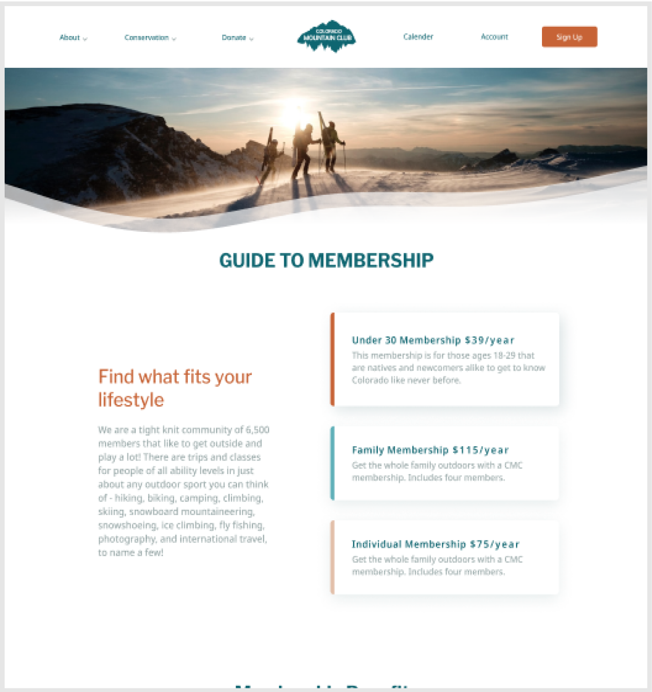
Membership Page
This page went through some major design changes. I switched up the UI cards in a vertical position to display more information about each membership category. The most popular membership is highlighted to catch the users attention.
The rest of the page shows and explains all of the other perks of being a member. This includes more information about group outings and course, as well as member discounts.

Responsive Design
Let’s face it, most people view websites on their phone. Creating mobile screens improves the accessibility for a wide range of users. Colorado Mountain Club’s landing page is the entry point for both new and returning users. The main difference between desktop and mobile is the hamburger menu located on the left of the screen the CTA’s working as the main focal point.
FIND YOUR COMMUNITY: The mobile version of the “Special Interest Groups” makes use of one column for content, while the desktop version makes use of two column and a slider feature.
GET INVOLVED: The mobile version of the UI cards are stacked vertically rather than horizontally. Users can scroll down to view the other ways to “Get Involved”.
CALENDAR: The contents of the calendar differ greatly for the mobile breakpoint. The mobile version has filter chips to funnel the categories by a simple touch. The categories are color-coded and the adventures pop up below with a description. This keeps members and non-members up to date with the latest adventures!


Reflections
Looking ahead, in the scope of the website and the goal of attracting or retaining new members, a few ideas came to mind:
- Feature more video content that shows what CMC is all about
- Include a forum for meetups, plans, and give new users a chance to see who they’ll be working alongside
- A creation of an app for members